Project Introduction
My client would like to have a new website after New Year 2021. She would like to it to be easy to use for users and to have minimalistic style. She shared some details that the website should be a single page website, should contain the price for services so all information would be easily accessible, and it should be in purple color.
My Role UX designer and UI designer
Project Scope
UX Design
User Interviews
Empathy Map
Wireframes
UI Design
Mood board
Styleguide
Visual Design
Mockups
Testing
User Testing
Testing
Usability Testing
A/B Testing
Target Users
I interviewed 5 different users (2 different types). The target users were:
- clients who had more than 2 visits in this massage shop
- people who would like to have massage and live in Mt.Eden
Insights from user interview
Look and feel
Most of users mentioned that it’s important for them to feel relaxed while browsing a massage website as well as they want to see that a company is a trusted place where they can go without further regret. All of them mentioned that they don’t like to read much text on a website and would prefer to see photos instead, if possible - especially for service descriptions.
Pricing
Users like to see pricing information, currently running promotions and package deals to compare it with the other providers to make a wise choice.
Location
All users prefer to see the location and be able to find it easily on Google Maps. Carpark information is also important for all users and they mostly prefer to drive. This massage shop, fortunately, is located in Mt.Eden where many free carpark are available off street.
Control
All users would like to have an “online booking” option where they can check all prices, see photos, available time slots with staff members (if more than one is available) and then book online instead of calling to a shop and sort out on the phone about next available date and time.
User Feedback Summary
All users, despite having massage experience, wanted to see a modern website with an online booking option present. Thus, look and feels of the website is very important as well as pricing and location. This will help them go through the website with relaxing mind.
Empathy Map of User
I created an empathy map to help me understand the user’s mindset and keep my project on track.

Raj
Says
- What kind of massages do I need?
- Which shop shall I choose?
- Are they experienced enough to do it?
- I like clean place and want to feel relaxed
- Why should I go for massage
Thinks
- They don’t even have a website! How can they effort then to do a high quality service?
- Is it worth my money?
- How can I get there?
- Can I book in advance online?
Does
- Searches on Google for massage shops
- Looks at the reviews
- Makes a phone call and asks
- Drives pass by to have a look at the shop
- Books online
Feels
- Curious
- Nervous
- Excited
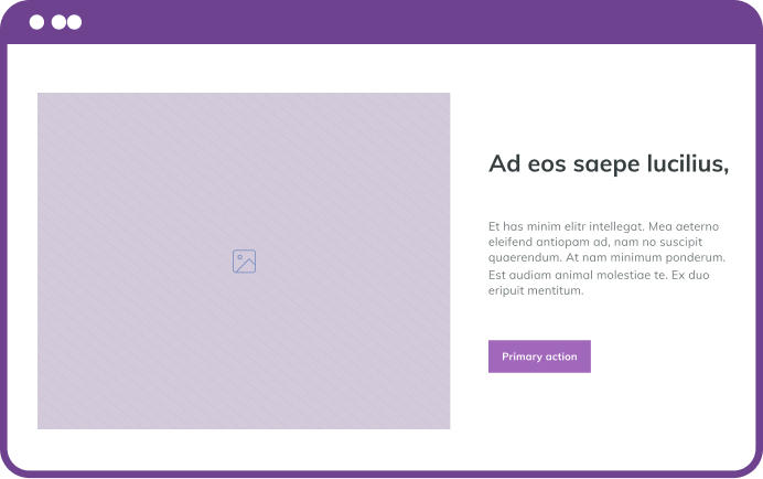
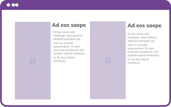
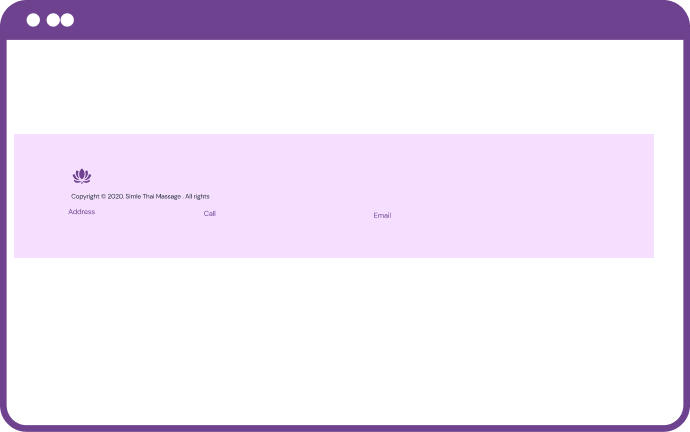
Wireframes
I created wireframes as the first attempt towards designing a solution based on user’s feedback and must haves. I used the crazy 8 method to explore the layouts and UI design against key features, then I pick up 3 wireframes for users to choose to see which ones work better.
Header sections
Body sections
Footer sections
Header sections
Body sections
Footer sections
Mood Board
My mood aimed to reflect a clean, relaxing, minimal design website that used a mood setting colour and vibrant iconography.


Design Language System
01 Colors
I used colours in order to make user’s interaction easier and more predictable. The main purpose of these colours is to assist in navigation, highlight important information and create a more cohesive and enjoyable user experience.
#A168BB
#C099D2
#F8EAFE
#FCF9FF
#FFFFFF
02 Typography
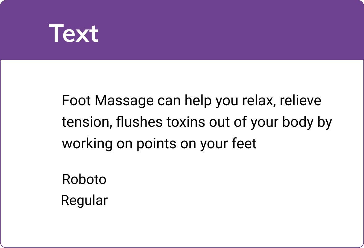
Smile Thai Massage and Spa use of two fonts, one for its Logo and Headings and the other one for normal text.
Key Features
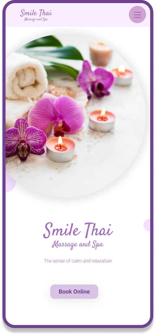
The final mockup aimed to make the online discovery of Smile Thai Massage and Spa easy and interesting. The design was purposefully clean and simple in order to reduce cognitive load.
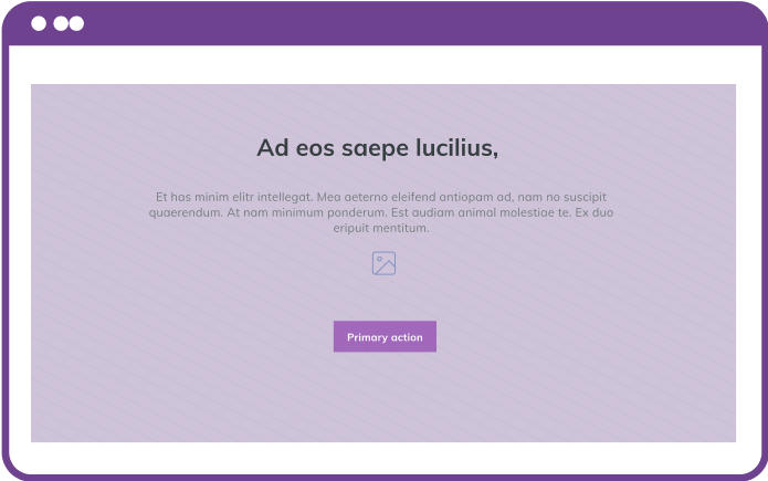
01 Why Us
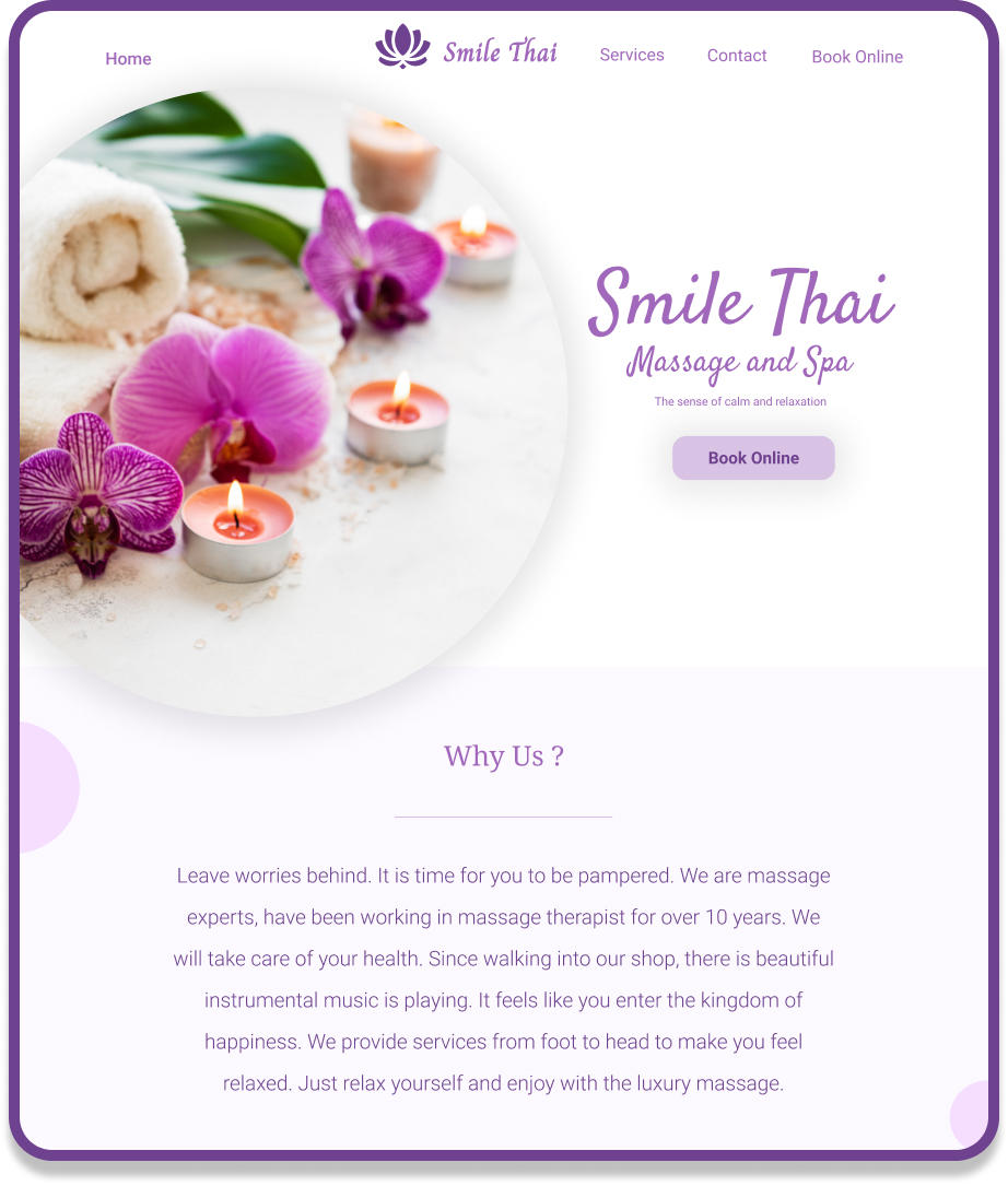
As many users coming to the website have a question “Why should I chose this company over another one?”, I decided to include the “Why Us?” section close to the top of the page so it’s visible when a user navigates to the website, they will see the information that best represents the current company - a connection statement - that helps retain website users.
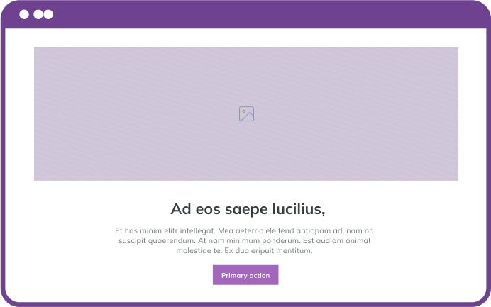
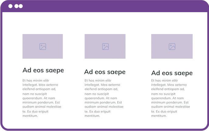
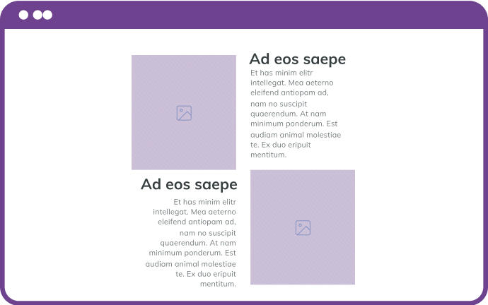
02 Explore services & Promotions
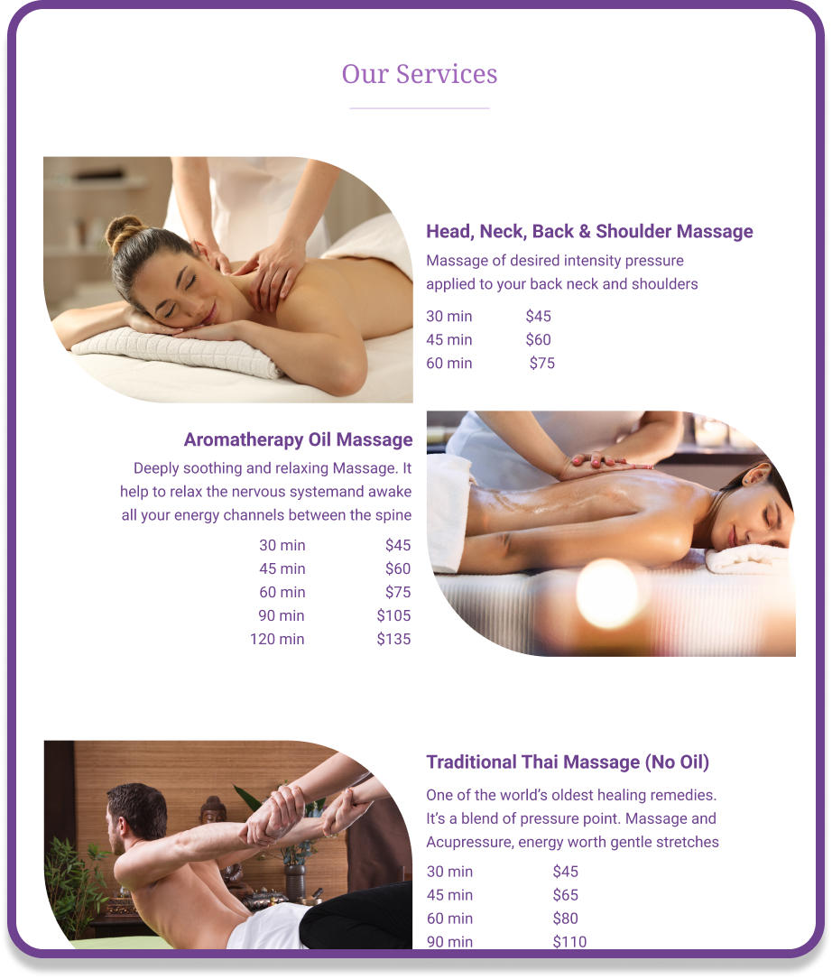
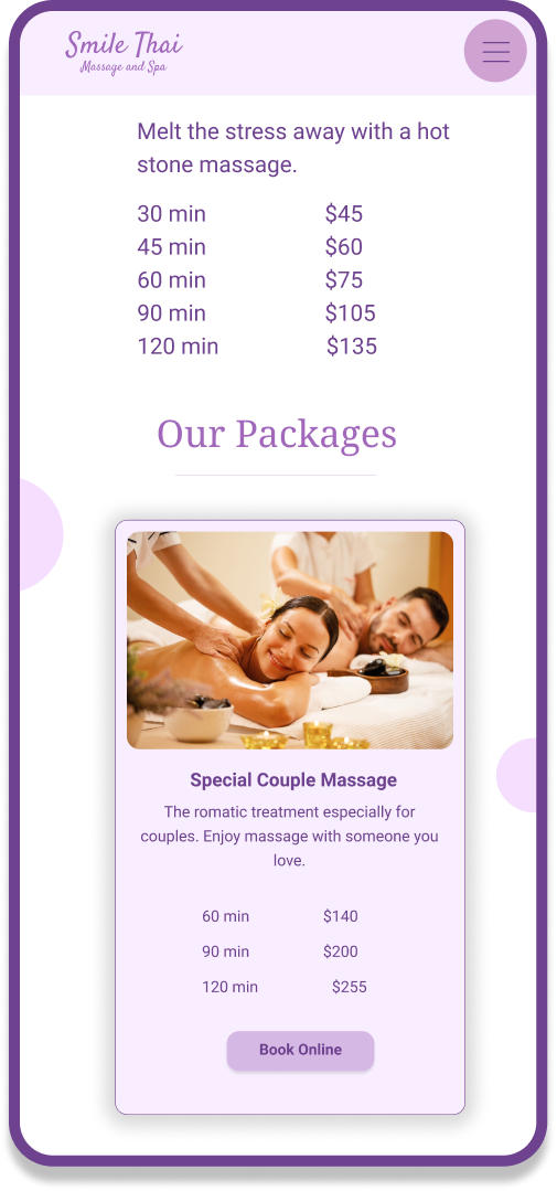
After usability testing and A/B testing I finally got the winner for one of the service designs to meet the client requirement that the price to be shown at each service card. I also applied a bit of animation (done by a development company) to make the website look more modern and relaxing. All the photos are prepared by the client.
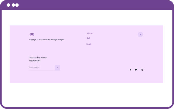
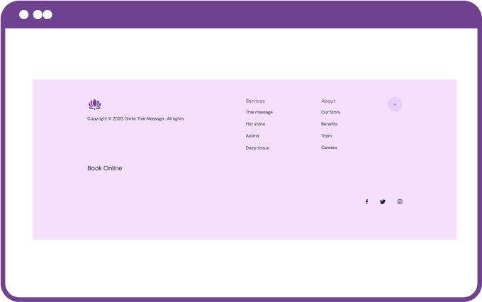
03 Contact
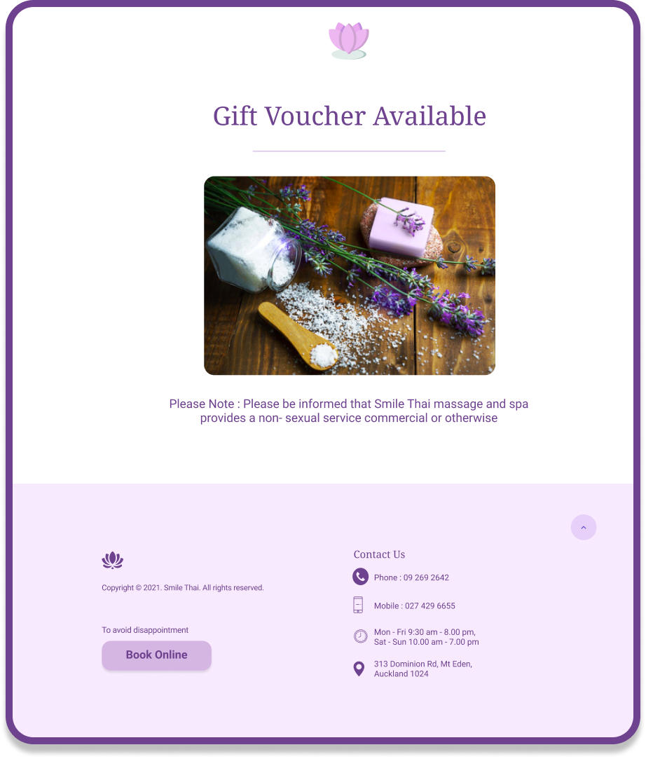
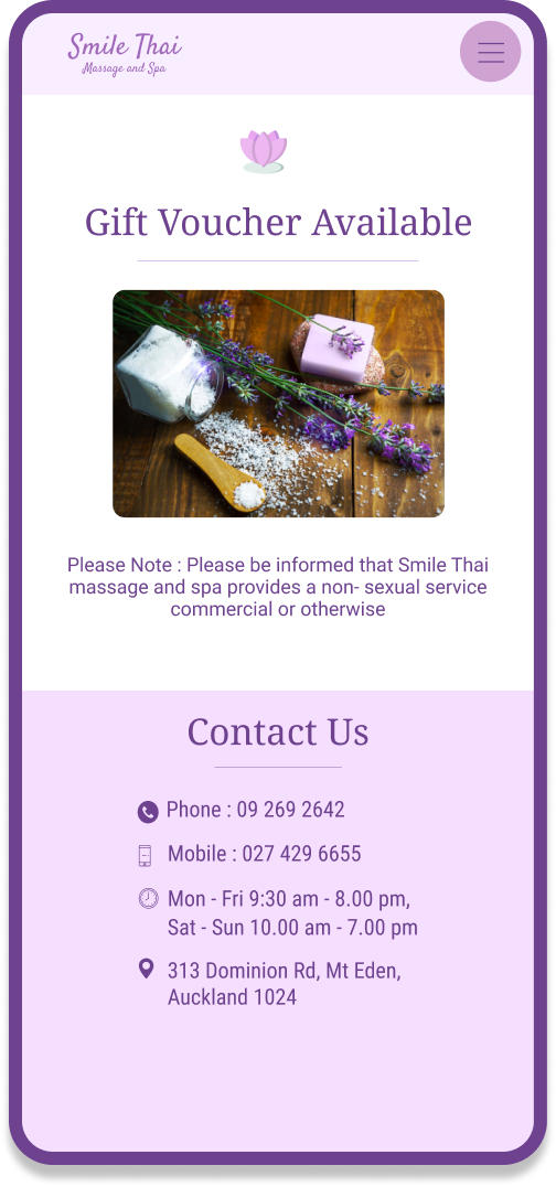
When users make a decision to get massage from a particular shop, they want to know where the shop is located. Some of them prefer to go around and check the area first. The shop open hours is a must to see as some shops are not always open.
Conclusion
It was honoured to apply UX/UI methods on smilethai.co.nz to help a small business keep going in New
Zealand. I put the user’s needs first and took a holistic approach to UX. As I showed,
from the begining I conducted interviews and collected all data from my users, then generated the example
content wireframes for the client, started thinking about the content structure
and tried to put the page in the best way as much as possible. However, the client wrote all content by
herself. Overall, the client was happy with this project. And what about you?
Special thanks to Redium (redium.co.nz) for web-development of this project.
Thanks for reading!
If you have any feedback, want to collaborate or just want to say hello, hit me up!
ruby@prapaipan.com