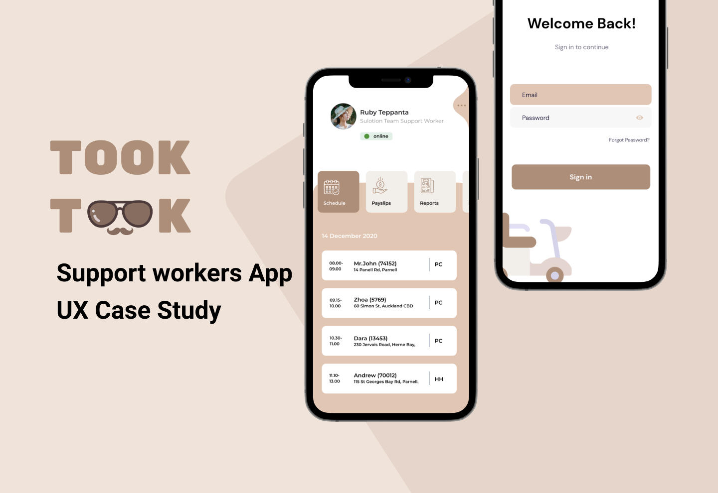
TookTook is a mobile application for support workers who always work with their clients and need to communicate with an office. I created this app as a part of my UX course at Coursera provided by Michigan University. As the sole UX designer, I designed this project from inception to final design through research, ideation and UX design principles.
Duration : 6 months
Methods : Surveys, Interviews, Card Sort, Affinity Mapping, Preference Test, Wireframes, Prototyping
Tools: Figma, UsabilityHub
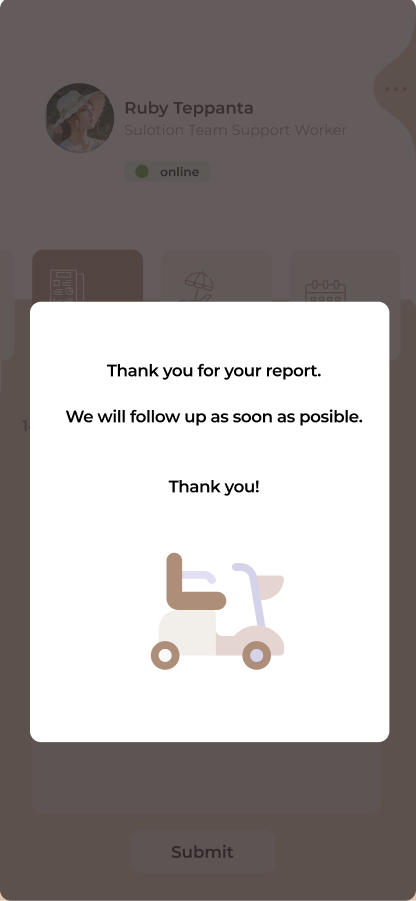
Support workers spend some time on communication with their office to report, update, receive additional information that they come across during their shift. This might be a change in their schedule, traffic issues and hence running late to their clients, clock in and out to and from clients etc.
This application is built to automate these actions and reduce time consuming actions. Thus, support workers can spend more time on driving and working with clients.
Competitive Analysis
To get a better understanding of the competitive landscape, I conducted analysis on the current market app that support workers use and found that it provides a useful tools for support workers. Though, there was not enough information in the app if support workers want to understand more about their tasks for each client. On the downside, some functionality is linked to a third party services that they have to access through a browser which could be overwhelming for some users, especially those unfamiliar with technologies.
Surveys & Interviews
With the goal of understanding how to make this app useful for users, which features they thought were the most important, and the issues they were facing, I surveyed 30 support workers with different level of care experience and wanted to understand how the users’ answers would vary depending on their skill level.
Key Findings & Insights
The surveys and interviews helped me understand more about the needs, goals and frustrations of my users, and I was able to pull a few key findings that would help shaping this project. Please see next below.
Keep It Simple
Some users are not good in technologies and want to use paper. So, I would like to take a simplistic approach with necessary data presentation, and make Took Took App easy to use.
One Stop Service
Users don’t feel comfortable to use multiple systems to achieve their goals with the current app. Thus, I put all required functionality in the Took Took app.
Be online
Even when the app is closed, it supports push notifications, so support workers won’t miss any important or urgent information.
Finally, I created user stories that could help me stay on track with the main goals of the app. I could always come back to these stories to make sure that after designing a next feature the app is still on track to resolve the issues support workers had with the current app.
Problem Statement
Regardless of technical knowledge of support workers, all of them should be able to use the app freely without any excessive app and system training.
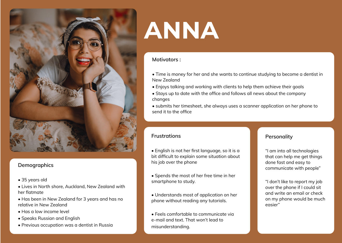
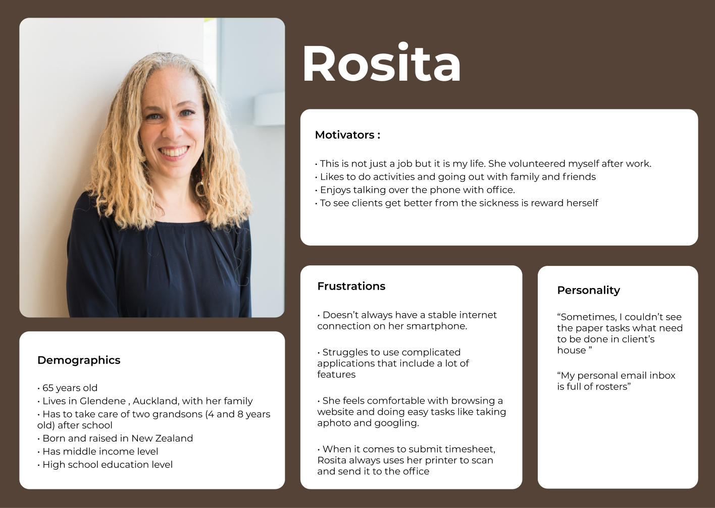
User Personas
Based on the conducted interviews and after processing the final data, I created three different personas representing 3 different technical skill levels. So I can keep them in mind and use the user-centric approach while creating the app.
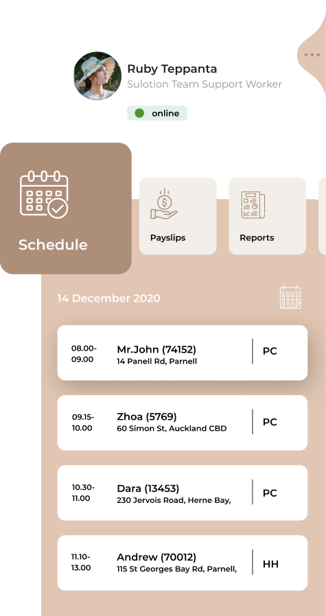
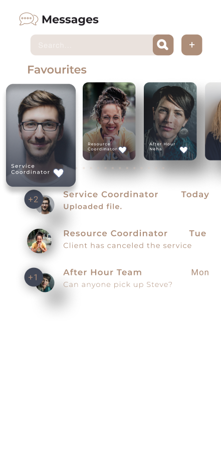
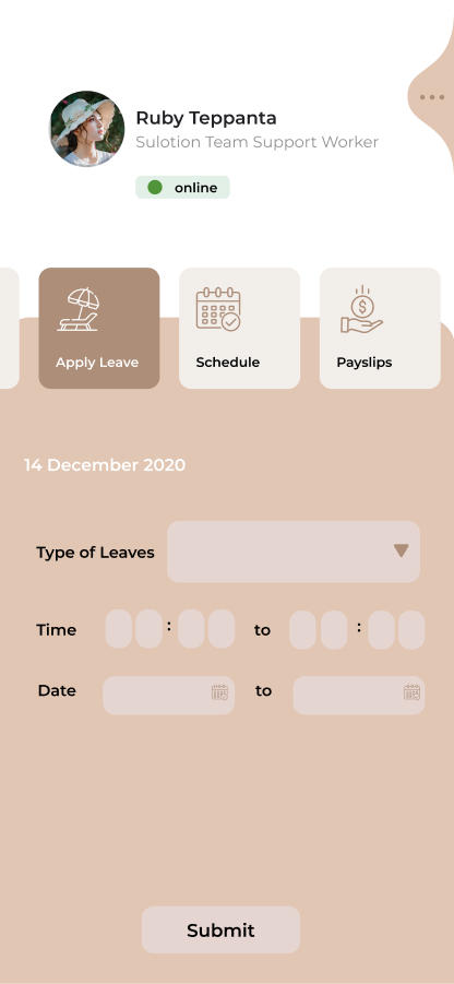
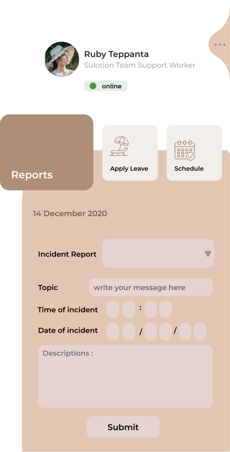
Schedule
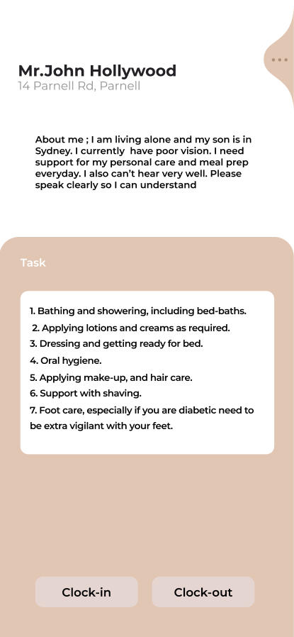
An ability to see all scheduled clients for the future and in the past. And a full working history for your clients. It allows you to be organised on your schedule.
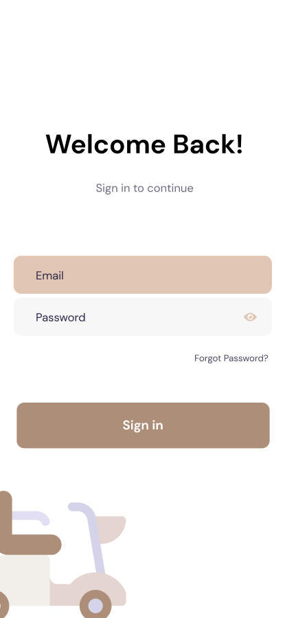
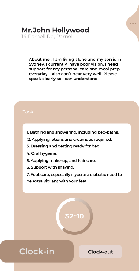
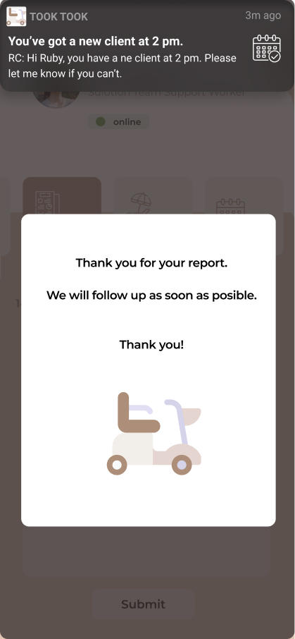
Log in/out
The app tracks your location in background. You don’t need to clock in/out using client's phone anymore. It knows precisely what time you started and finished with a client.
Chat
Private secured chat is designed for cases when a call to the office can’t be made. For example, a support worker don’t want client to hear what they are sharing with the office.
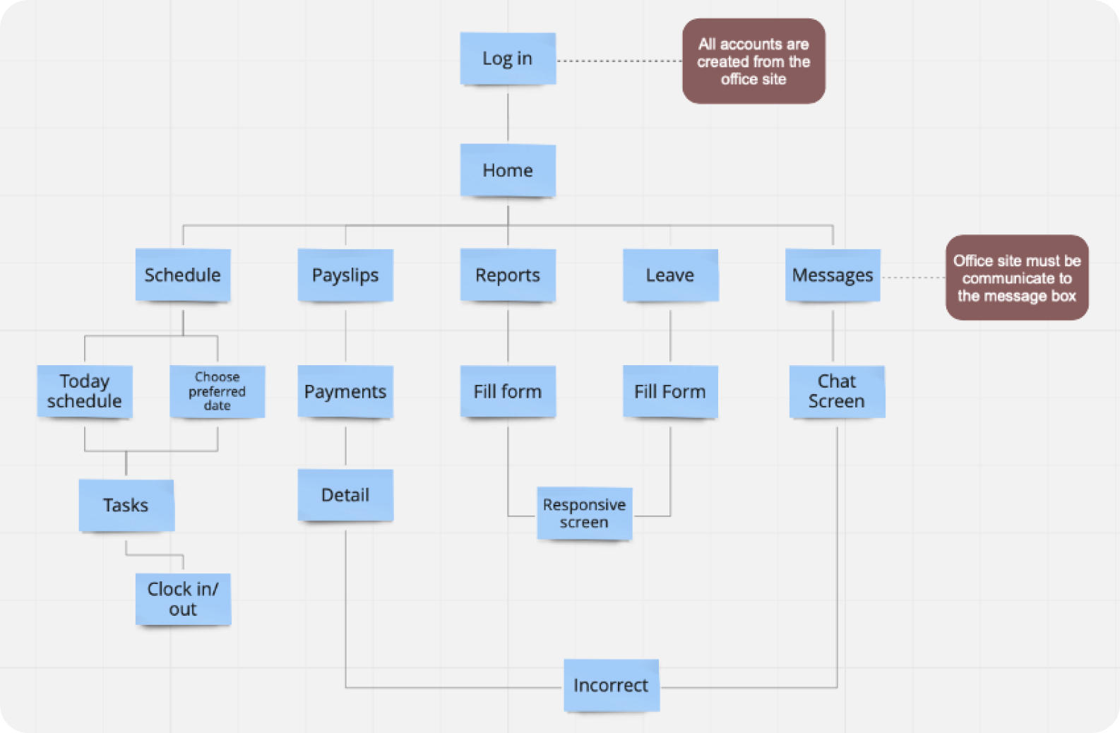
This site map was developed while keeping the problem statement mentioned above the Took Took application must not only provide the functionality that is useful but it’s navigation must be intuitive
Low Fidelity Wireframes
On one hand, having intuitive navigation with as less screens as possible will make the Took Took Application easy to use, but on the other hand putting a lot of elements on each screen would over
flow them. Thus, instead of making the app more difficult to use I tried to balanced between simple navigation and simple screens.
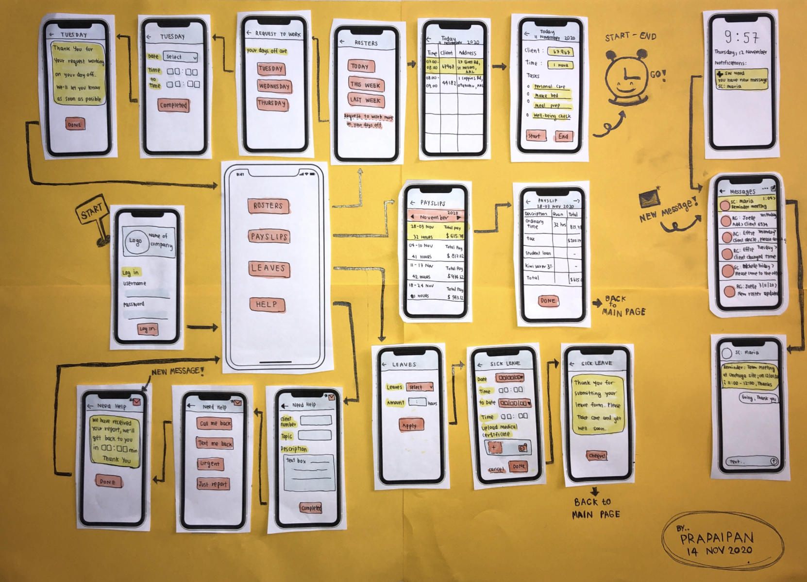
Mid Fidelity Wireframes
Once I have finished Lo-Fi wireframe, I created Mid-Fi wireframe in Figma so users can click and test it.
I have conducted the usability testing and iterated the design again to improve the performance and the feeling of satisfaction for the app. I knew how long participants took to complete specified tasks, and I adjusted the final design to meet the participants expectations.
Give more detail
Feedback from almost all participants specified the need of seeing the service task list for a service that is currently in progress to make sure all items are carried out.
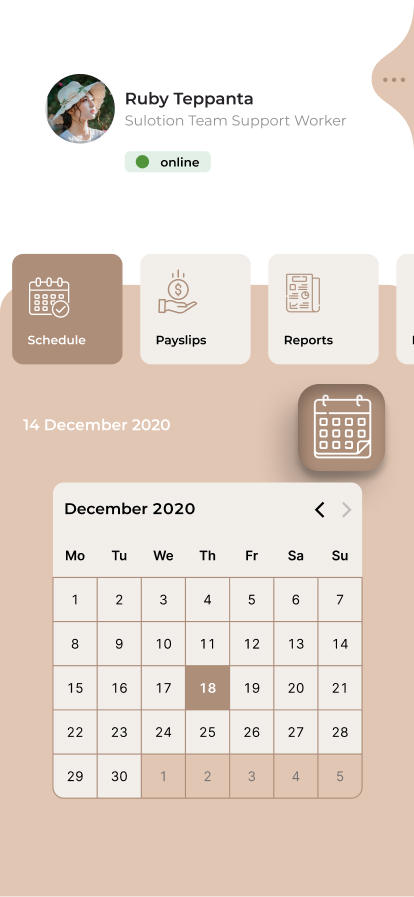
Calendar
Instead of choosing the date to see your roster, like it was on the wireframes, I created a calendar for users to choose the preferred date to see their schedule. Giving more control to users is a part of UX principles and will make things easier for them.
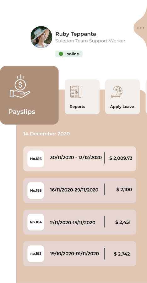
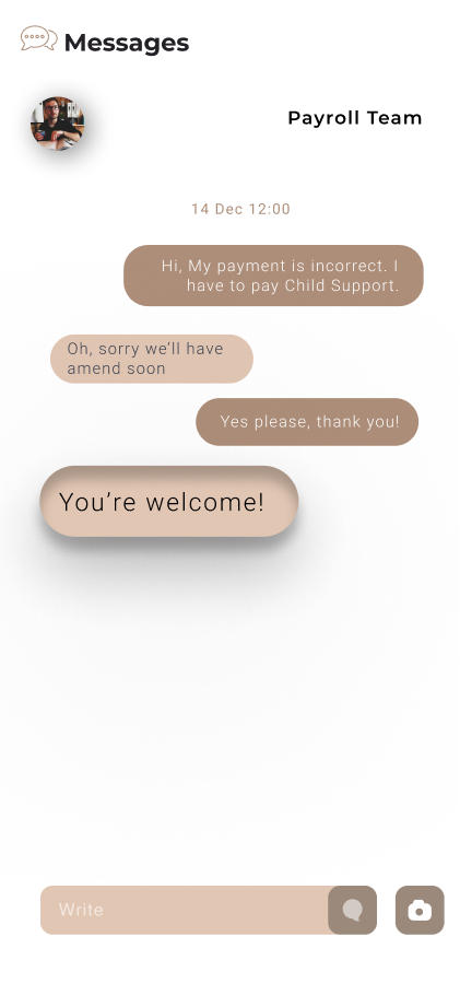
Incorrect Payslips
In my initial interviews, I got a vast number of users who got incorrect payments from time to time. So I decided to put an "Incorrect" button on the "Payslip" screen for users to interact back to the payroll team. The Payroll team will be notified which support worker contacted them.
Features
In my initial interviews, I got a vast number of users who got incorrect payments from time to time. So I decided to put an "Incorrect" button on the "Payslip" screen for users to interact back to the payroll team. The Payroll team will be notified which support worker contacted them.
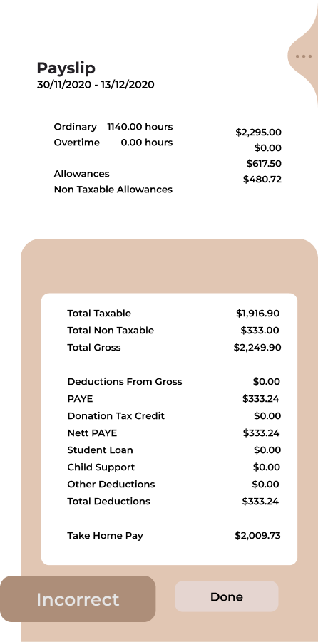
This was my first UX case study project that I kept asking myself about how I can position all the required elements on the payslip screen without making it too small. I did manage, however.
What can be improved?
1. I would think more about how to make the Payslips screen work better. Maybe even make it interactive.
2. For this project I used Figma to do all prototyping and I would say that my Figma knowledge are on the expert level but I still want to learn more of the other platforms like Adobe XD and Photoshop to make my Took Took Application look better.
3. I would like to make the dark mode design. It can help devices on battery saving and many users prefer a dark mode over a normal one.
What's next?
Think more about how the system would look like and work for the office guys. I am sure that it will be a lot more complicated than the client side because every time when a support worker clocks in or out, the office needs to link to payroll to calculate the mileage for support worker and about how long they travel (potentially a place to connect Google Maps API here).
Thanks for reading!
If you have any feedback, want to collaborate or just want to say hello, hit me up!
ruby@prapaipan.com My other projects